Case Study - Creative Logo for Brand.
We were assigned to work on a book cover for Tera Form Studios. They have kept us abreast of their project since it 1st started and they trusted Wallace Studios to deliver on their Graphic Assets.
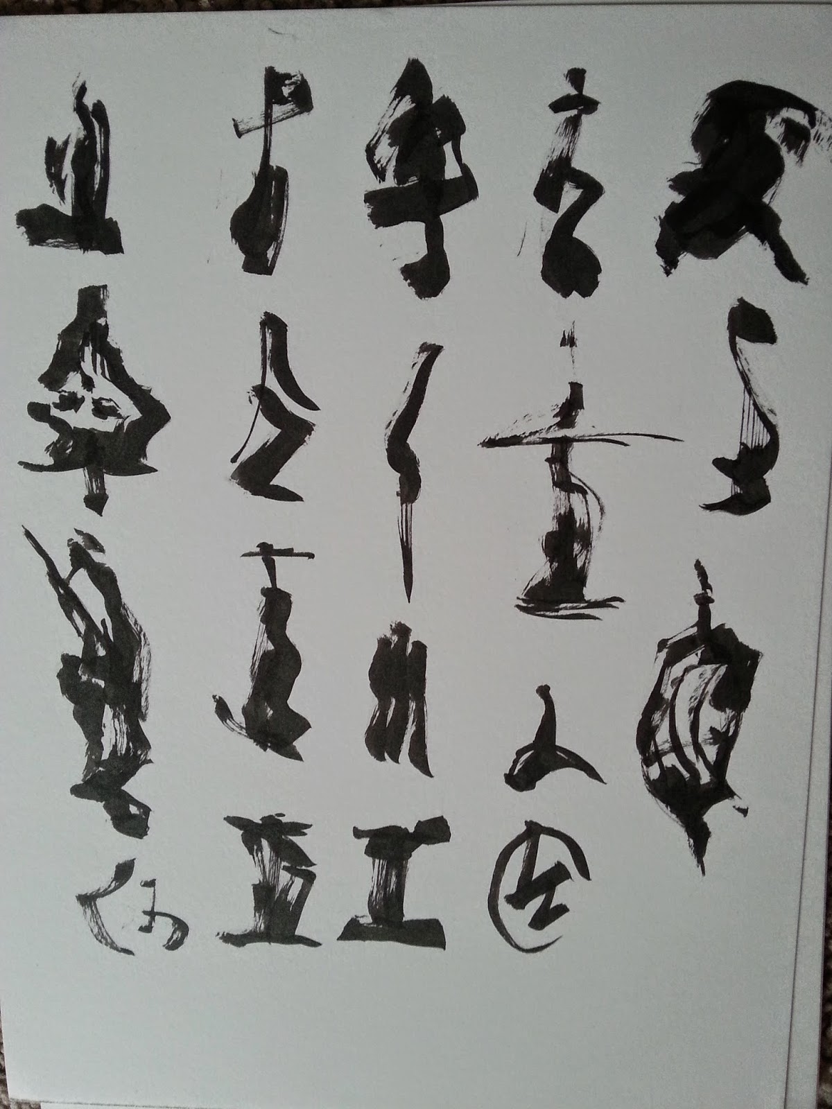


1st we created a few sheets to give his " G " a custom shape. We used Japanese Caligraphy Pens to achieve this look. We love the loose brush stray lines and the inconsistent ink flow.
It was Narrowed down to 3 concepts
The one they liked, we blocked out the parts we didn't like and began pushing the design.
After the Image was approved we vectorized the final image where the final version was emailed to the Happy Client.
Next Book Covers.

Comments
Post a Comment